
Product design and information architecture for a real-estate platform
BRANDING
INFORMATION ARCHITECTURE
UI/UX design
USER FLOWS
BRANDING
INFORMATION ARCHITECTURE
UI/UX design
USER FLOWS
Context
Monto brings rentals, property sales, and property management into one platform. The brief came through a PR contact: design and ship it alongside a marketing push that was already running.
Monto brings rentals, property sales, and property management into one platform. The brief came through a PR contact: design and ship it alongside a marketing push that was already running.
Role
Lead designer, working with a developer and the client's PR, communications, and product team.
Lead designer, working with a developer and the client's PR, communications, and product team.
Brand system
Monto runs rentals, sales, and management under one name. The identity had to hold all of it: a working palette, a logotype adapted for web, a favicon, and the visual language the pages share.
Monto runs rentals, sales, and management under one name. The identity had to hold all of it: a working palette, a logotype adapted for web, a favicon, and the visual language the pages share.


Architecture and user flows

Monto had a one-page site before this. The new structure splits by client — looking for a place or owning one — and every path ends at its own inquiry. Short-term rentals book through a third-party system.
Monto had a one-page site before this. The new structure splits by client — looking for a place or owning one — and every path ends at its own inquiry. Short-term rentals book through a third-party system.
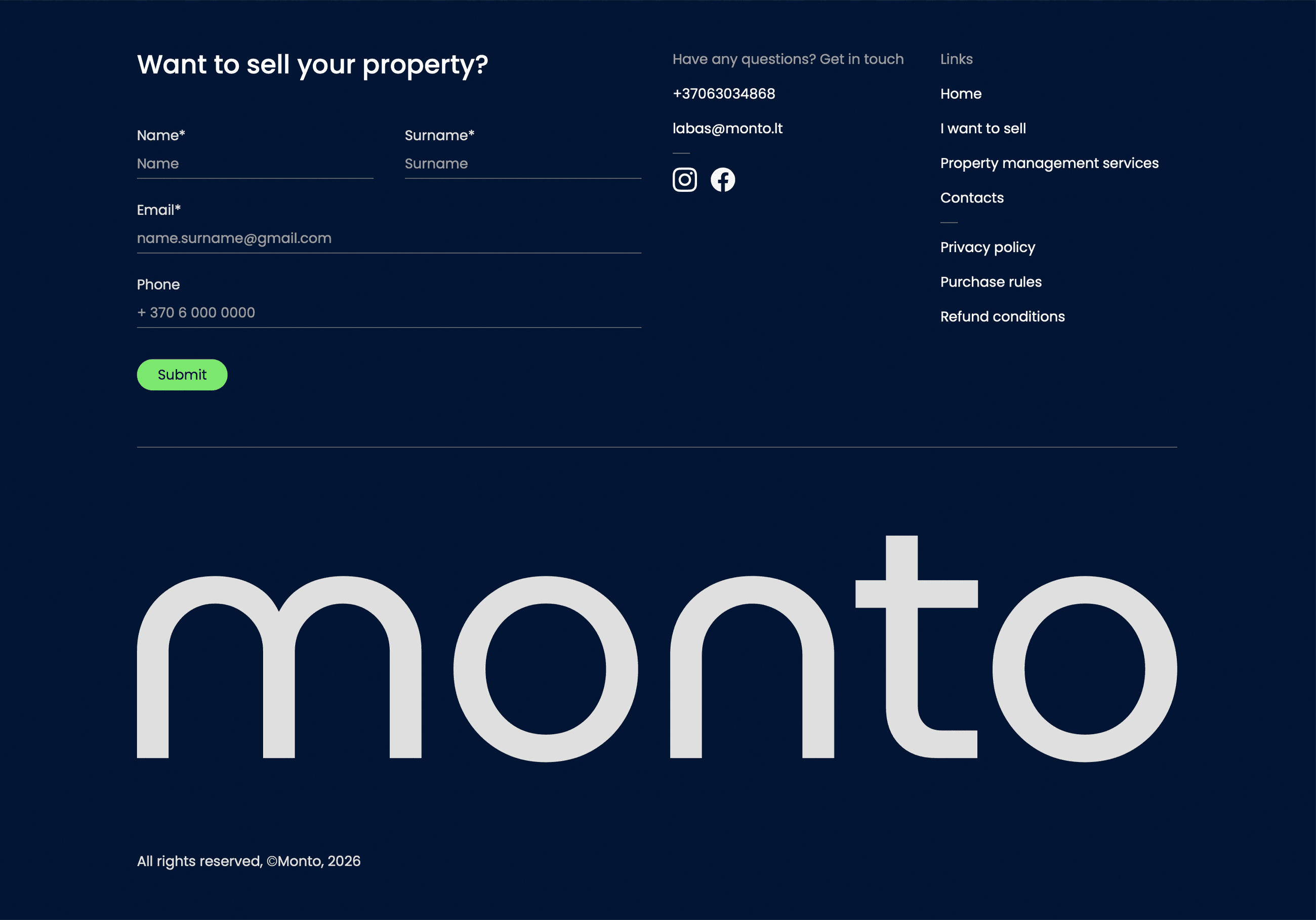
Final product


Final note
Marketing was already live when design started, so most decisions had to work the first time. The structure is what made that possible.
Marketing was already live when design started, so most decisions had to work the first time. The structure is what made that possible.
Next project

B2C gift-giving app