Context
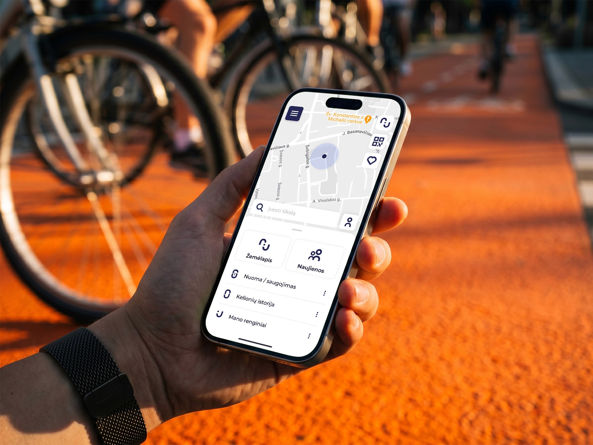
Judu is Vilnius's unified transit platform — public transport, parking, micro-mobility, one app. I picked the micro-mobility brief during my final year and worked with Judu's product team throughout.
The module was backed by a 60–70 page thesis covering UX/UI research and competitor analysis.
Role
Sole designer on the micro-mobility module. The other modules were designed internally by Judu's team.
Outcome
Delivered as a full presentation after my thesis defense. Parking and public transport later shipped as an MVP through an outside agency, after Judu restructured internally. Micro-mobility wasn't part of that release — whether it joins is theirs to decide.


Micro-mobility had no defined product yet, unlike the other two modes. Riders didn't see themselves in Judu — a positioning gap before a design one.
Solution: a shared color marks the multimodal identity across every touchpoint — orange, pulled from Vilnius's cycling lane markings.


Potholes and hazards go unreported until someone gets hurt.
Solution: riders photograph and flag them — a heads-up to other riders, a signal to the city on where to fix roads. Same pattern as Waze, applied to cycling infrastructure that rarely gets it.

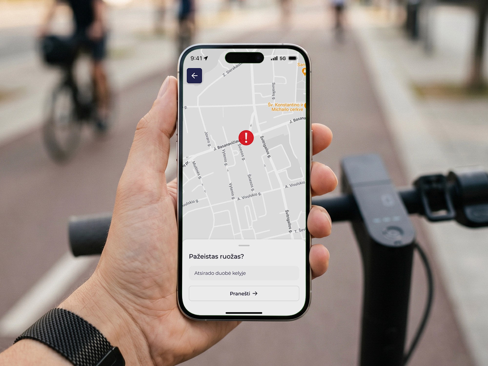


Waze proved the pattern works for cars. With a huge amount of minor injuries that occur with the e-scooter and cycling communitios, Vilnius's sustainable mobility plan should explicitly focus on building this kind of feedback loop.
Most transit maps bury the road under cafés, museums, and points of interest — clutter for someone riding at 9pm.
Solution: strip it to roads, routes, riding-relevant points. Night mode dims the rest so the eye stays on the road.


Note: The solution to hide places that are closed was presented as an idea and was not implemented in the design.
A stock icon set reads generic from the first screen.
Solution: drew the icons from scratch — linear weight, lightly rounded, matched to the app's geometry and used the style of Judu's logotype.

Drew the icons from scratch. Linear weight, modern construction, lightly rounded to match the app's geometry. A stock set would have been faster and made the app read generic from the first screen.

Drew the icons from scratch. Linear weight, modern construction, lightly rounded to match the app's geometry. A stock set would have been faster and made the app read generic from the first screen.
Built in Figma with local variables and components — color, type, spacing, radii, shadows — wired so changes propagate.
The module ran as a working prototype, not static screens. At my thesis defense, a committee and outside visitors used it live while I walked through the core flows.
Real client, tight timeline. The hardest part was making the micro-mobility section still feel right next to existing parallel designs while also iterating and trying out new use cases.